Classic Comic Fridays: X-Men #95

It has been about four months since I’ve last done a Classic Comic feature. For the new folks here, Classic Comic Friday’s feature a comic from my personal collection which I look back upon and review. Then, if we’re lucky, I can compare it to newer comics similar to it so we can see how things have changed.

This past August, I was fortunate enough to find a decent-quality copy of X-Men #95: The death of Thunderbird. He was arguably the first X-Men to be killed (because people debate Changeling), and set-off a idea of the “unknown” with these X-Men comics. Another notable mention is that X-Men #95 features Chris Claremont’s second story with the X-Men.

So here we go:

X-Men 95

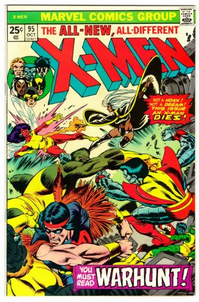
X-Men #95 (October, 1975)
Chris Claremont (writer), Len Wein (plotter), Dave Cockrum (pencils, cover), Sam Grainger (inker), Petra Goldberg (colours), Karen Mantlo (letterer) Cockrum, Gil Kane & Dan Crespi (cover). $0.25

If you were unfamiliar with the X-Men prior to this issue, Claremont and Wein set up this story so you can fully grasp each character within the first few pages. You find out who is the strongest, which heroes can fly, who the X-Men’s field leader is, plus who has the smartest mouth and who has the biggest ego to them. All within the first few pages. Within those pages, would you believe we also get a recap to who all the villain is – Count Nefaria – AND his masterplan! They certainly do not make stories like they used to.

So now that everyone and everything is established at the beginning, the rest of the story is a playground of fun ideas to entice the reader to keep reading. Nightcrawler teleports in the enemy base to let the X-Men in, followed by a battle between the the villains evil creations: The Ani-Men and X-Men. Just when the X-Men have seemingly won, Count Nefaria escapes in a jet plane. Fortunately, X-Man Thunderbird follows suite and jumps on the plane. As Nefaria tries to escape, Thunderbird uses his brute force and beats the plane down to stop Nefaria at the price of Thunderbird’s own life.

As shocking as it comes to a comic reader that a hero had just died, it was done so artistically well, thanks to the legendary Dave Cockrum. Well-known for his clean pencils and well-plotted out panels, Cockrum owns this book. When the X-Men are on a mountain, their hair is blowing. When problems appear, the faces clearly represent what the characters are saying or feeling. The action sequences are never jumbled and without dialogue, we can tell what is happening in the story. It is very rare to see comics these days like that. But like I said, Cockrum owns it.

Thunderbird's Death

In fact, the whole artistic team really controls this story. While the exposition sets up the characters, the true feeling of this story comes from the art. With a very James Bond-like tone, it’s as if the reader can feel themselves in the trees on a mountain or smell the machinery inside the hidden base. Both Grainger and Goldberg accentuate Cockrum’s pencils with a tremendous dramatic effect. Nothing is overdone on the inks and the fluidity of colour is spot-on. Vibrant sheens across each page really gives this book a light-hearted tone – setting the reader up for the unexpected.

The most exciting part of this book is definitely the unexpected death of Thunderbird. The build up, while readers have seen it in hundreds of comics throughout the years up to this point in 1975 – the death was sudden and done tastefully. The X-Men do not take the death lightly. However, because of the character development and the “team” feel the book gives, readers are forced to read on to the next issue to see how the team deals with the death.

That’s right. There’s no twist ending to make readers want to jump back to the book like a season finale of a TV show. Claremont and Wein compel readers to come back because throughout the book readers are forced to care for the characters. And that’s a more powerful reason to continue reading a book than any cliffhanger could bring.

Grade: 8/10

Looking back on this book, it’s amazing to also consider that Thunderbird is one of the few Marvel characters whom have stayed dead. Aside from some flashbacks or the more-recent Chaos War – Thunderbird, John Proudstar – has stayed dead. It’s interesting to see why that has been the case. Three issues in, of course he would not have a lot of reader fanbase – but it still remains.

To top it all off, there was no cliffhanger of a villain suddenly appearing on the last page. Nor was there a jaw-dropping moment for readers to say, “Wow! I need to go back and read this book!” The readership is solely gained because of how the writers make us feel for these characters. Name three comics nowadays that end that way. It’s pretty hard to come up with a list.

And don’t forget to check out UncannyDerek on Facebook and Twitter!

So until next time, keep on Space Truckin’!

The X-Men’s New Rosters – Who Did You Choose?

From both Uncanny X-Men #1 and Wolverine & The X-Men #1, we get to see who took which side.

Who did you end up siding with? Wolverine or Cyclops? Click for a bigger picture on both rosters. The wonderful artwork was done by Irene Lee.

Let us not forget that these charts are still missing personnel from Uncanny X-Force and X-Factor.

Wolverine at the Jean Grey School of Higher Learning:

Wolverine Faculty

Cyclops on Utopia:

Utopia

Keep on Space Truckin’!

Review: Uncanny X-Men #544 – The Final Issue

After decades of joy and millions of dollars in revenue, Marvel concludes the solid Uncanny X-Men series to re-open a new chapter in the lives of our favourite mutants.

But is the final issue any good?

Uncanny X-Men Final

Uncanny X-Men #544
Kieron Gillen (writer), Greg Land (pencils, cover) Jay Leisten (inks), Justin Ponsor (colours), Joe Caramanga (letters). $3.99

Gah! That cover!

As the series concludes, one thing is for certain: Gillen owns these X-Men. Not since Claremont have I seen someone have such a great voice for each character. I know I’ve said that before, but it rings true. I feel that these characters are completely safe under Gillen’s rule.

That being said, he doesn’t play with a lot of different voices in this issue. A discussion between Cyclops and Iceman runs through most of the book, while a major X-villain gives context to their discussions within his/her own telling. What Gillen does with UXM is allows the reader to see is how much Cyclops has matured since first starting as Xavier’s student. Concluding as a touching story, Gillen sets up the newest storyline coming out next month with Uncanny X-Men #1.

And then there’s Greg Land. Working with mostly males in the story, he does a pretty decent job without having sexually-posed people. However, you can see Iceman aged from a twenty-something-year-old to fifty in more than one panel. A major splash page representing Cyclops reflecting on past X-events is also sullied by a stiff Jean Grey which may be easily mistaken by many other Land X-heroines. Not to mention that he’s recycling himself with many characters. . .

Uncanny X-Men 544 Preview

My only real “beef” with the book – Land aside – is actually one character Gillen seems to throw under the bus: Beast. I don’t know why Beast is the jerk he is in this issue, but yup, he’s a jerk. I’m not entirely sure what the reasoning was for Beast to metaphorically throw mud in Cyclops’ face for, but Gillen made it happen.

For the final issue of my favourite comic series, it ends somberly – closing one chapter and forcing another one to open. It’s just a shame that Land is the one doing the art.

Grade: 6.5/10

Keep on Space Truckin’!

Avengers: The Children’s Crusade

There’s very few Marvel stories that rarely get me excited every time I pick up a new issue. This is even truer when it comes to books released on a bi-monthly schedule. I mean, who remembers what happened two months ago?

Avengers: The Children’s Crusade has been an on-going story mixed with incredible drama, high-action, and brilliant art. To top it all off, it drastically has an effect on the Marvel Universe – despite it being considered only a mini-event.

Each issue has me begging for more. With each issue that goes by, I have no idea how the series could conclude. Indeed, this series should have been marketed much stronger by Marvel.

Avengers Children's Crusade

Avengers: The Children’s Crusade #7 of 9
Allan Heinberg (writer), Jim Cheung (pencils, cover), Mark Morales, John Livesay, Dexter Vines, & Jim Cheung (inks), Justin Ponsor (colours, cover), Cory Petit (letters). $3.99

Concluding last issue, Wanda restores the powers of the mutant Rictor from X-Factor – showing that she can reverse all of the effects done by her on M-Day. But of course, arriving on the scene, The Avengers, Magneto and the X-Men have their particular opinions to what should happen with Wanda. The Avengers want her back to normal, while Magneto wants her to herself. Surprisingly, Cyclops acts the most irrational of the bunch and demands justice for the damage she has caused.

Heinberg leaves the reader to quietly debate who has the most reasonable argument for what to do with Wanda. But for the first time in the series, we finally get to hear Wanda’s voice and her opinions. With so many voices in the story from various characters, you never feel confused on who’s who. Unlike particular Avengers books where voices become jumbled in the crowd (ie. Spider-Man & Hawkeye, Spider-Woman & Ms. Marvel), everyone in TCC has their unique personality – and it shows.

The story certainly takes a turn however, when Doctor Doom is thrown into the mix. A bit of background is finally given to “How Wanda ended up with Doom after M-Day” and it actually makes sense. To top it off, the tension in the last few pages between the Young Avengers and Doom will absolutely knock your socks off.

What else could I say about Jim Cheung’s art? He gets two months to work on this book and it shows. The intense detail given to each individual, the clarity to backgrounds, the pages with over ten different characters on it – all looks effortlessly immaculate. While my eye is not trained to identify inkers, it can be seen when they are changed in the artwork. All of it is tastefully done when involving a scenery change. As for Ponsor, never have I loved the colour pink or red so much as I have in these stories.

My only quibbles are with minute details: Cyclops acts nothing like how he would in an X-book and comes off rather ridiculous – even striking Captain America first. Of course, the other issue is Rogue’s bizarre costume-style which madam Kelly Thompson has already discussed on her blog.

It’s a shame that this series is ending in two more issues. The bigger shame is that it will still take four months to conclude.

Grade: 8.5/10

As a side note, you can see Rictor with his powers now in X-Factor #225 which was released today. If anything, this is a pretty big tip to help us figure out when The Children’s Crusade actually takes place in the Marvel Universe. (We’re not in X-Men Schism territory yet).

Speaking of Schism, please pick up X-Men: Schism #4 by Jason Aaron and the legendary Alan Davis.

X-Men Schism 4

After the Schism Preludes and three semi-lull issues of Schism itself, we finally have it: If there was any book to explain what splits the X-Men apart, THIS is it. Get on board and watch the X-Men split apart.

Wednesday’s Reviews: Empty Promises

With the X-Men’s Schism around the corner and the Fear Itself stories ramping up, I figured it would be best to review two very anticipated titles this week: X-Men Prelude to Schism #4 and Fear Itself: Black Widow #1.

But first, I must quickly mention Avengers: The Children’s Crusade #6. – Holy @*#$! What an ending! This is Marvel’s best series of the year. What a wild ride so far!

Now that that’s done:

X-Men Schism Prelude

X-Men Prelude to Schism #4 of 4
Paul Jenkins (writer), Clay Mann (pencils), Jay Leisten & Seth Mann (inks), Chris Sotomayor & Lee Loughridge (colours), Rob Steen (letters), Giuseppe Camuncoli & Dan Brown (cover). $2.99

I personally held off reviewing any of the Prelude to Schism stories until it became interesting. By the final issue, I’m really just reviewing it to complain.

In the prior three issues, readers get a brief history on the major players in the X-Universe: Cyclops, Professor X, and Magneto. By the fourth issue, we receive the same ideas, but with Wolverine. What the series ended up being is more a re-telling of each characters’ history, rather than pushing a story forward. Each issue, we’ve waited this much longer to find out what the threat to the X-Men is. We know that IT’S coming, but we have no idea what IT is. By the end of issue four *Not a spoiler alert* we STILL have no idea.

If you’re unfamiliar with the Wolverine Origin story, then this book is new for you. Aside from that, nothing new is teased for Schism. Well, I suppose one thing is that writer Paul Jenkins really likes is to make Wolverine look like a jerk. Alas.

Fortunately, Clay Mann’s art really shines in this issue. Flying through centuries of Wolverine’s past, Mann successfully shows us a descriptive story. From Wolverine and Rose, to Weapon X, to the 90’s X-Men roster, Mann shows a superb display of artistry. I love his rendition of 90’s Jean Grey. His colouring team of both Sotomayor and Loughridge also do an exceptional job in adjusting the colour schemes to fit the time line of each story.

Not trying to have this review as an entire tearing apart of the book, Prelude definitely served its purpose of getting people wondering what Schism is. This issue somewhat bonded Cyclops and Wolverine together, but also left a clue to what causes the split between the duo as well.

Although I’m still very eager to find out what Schism is, I just wished it hadn’t cost me $12 of already-familiar backstory that gets me nowhere.

Grade: 5/10

Fear Itself Black Widow

Fear Itself: Black Widow #1 (One-Shot)
Cullen Bunn (writer), Peter Nguyen (pencils, inks), Veronica Gandini (colours), Clayton Cowles (letters), Michael Ryan (cover). $3.99

After the Grey Gargoyle turns the city of Paris into stone, it’s up to the Black Widow to not do anything about it and take on Rapdio’s evil forces with Peregrine instead.

I was pretty excited for Fear Itself: Black Widow. After learning the fate of Bucky, I was sure she would have been interesting to follow through with. Turns out, she mentions him briefly, and argues that she must feel cold because she’s a spy. Right. While Paris is covered in stone, Rapdio decides to take advantage of the situation and gathers information of French missile codes to give to other crimelords. Knowing this, the Black Widow leaves America’s current turmoil to stop him. There, her and Peregrine fight to save the day, while Fear Itself becomes only a memory for the rest of the story. In fact, I have no idea what Black Widow actually feels during this entire story until the final page. And no, the feeling isn’t “Fear.”

What lacks in story is made up for with Nguyen’s stylistic art. Black Widow looks sharp, seductive, and surprisingly zipped-up (despite what the cover suggests) throughout most of the whole story. Gandini’s colours render well with Nguyen’s work as Black Widow slips in and out of shadows solely because of her attire. She is indeed dressed and made to look as a spy.

The point is that this Fear Itself story had nothing to add to “Fear Itself” and can, in fact, be entirely dismissed save for Nguyen and Gandini’s gorgeous renderings of Black Widow.

Grade: 6/10

There will be no Classic Comic Friday feature tomorrow because it’s Canada Day. However, it will arrive July 8th for sure.

And don’t forget to check out UncannyDerek on Facebook and Twitter!

So until next time, keep on Space Truckin’!

Wednesday’s Reviews May 18 – Take Two

Giant Size X-Men

X-Men Giant Size #1
Christopher Yost (writer), Paco Medina (pencils, present story), Dalabor Talajic (penicls, inker, past story), Juan Vlasco (inker, present story), Marte Gracia (colours, present story), Will Quintana (colours, past story), Joe Caramagna (letters), Ed McGuiness (cover). $4.99

Nothing shakes up the X-World than a new Giant Sized X-Men issue. I mean, a X-Men: Giant Size (let’s not get confused here).

Carrying from Gischler’s X-Men run, the team is battling for their lives on Utopia against the Neo’s – a group of highly evolved mutants. Their purpose: to figure out why a mutant baby has been born from humans but not with the Neo’s.

It seems to be a great story to tackle which but is suddenly dissolved when the Evolutionaries come in and decide to wipe out what is left of the Neo’s. Left in fear, the X-Men are beside themselves to see where the Evolutionaries will take them next. It turns out, Cyclops may have all of the answers locked in the back of his mind.

Of course, this can only be done via a retcon which is placed somewhere around X-Men #4 in 1964. Unlike recent retcons, this one still has a lot of room to work with, nor does it seem as if it will drastically change how the X-Men “grew up.” To top it all off, because the Evolutionaries are involved, you cannot really say, “Well Professor X would’ve found blocked memories” because they’re fricken Evolutionaries. It’s a pretty solid retcon.

What is very exciting is the massive cast of artists on board for the story. Medina and Talajic both compliment each other with two different art forms that stylistically blend well together. Talajic actually gives a “classic feel” with his art for his “past story,” leaving Quintana tons of room to colour over and make it still feel modern – a brilliant mix. It definitely is coloured like a 60’s comic but is rendered for current times. My only beef is how Jean Grey changes from a man-face to a woman-face in some panels. However, it’s forgiven with how much emphasis is placed into giving the characters great emotions.

With Medina, his battle spreads are awe-inspiring. The title page was so well-rendered with Gracia’s colours that I still cannot stop looking at it. With the Neo’s deaths too, the fear in the Neo’s eyes move me emotionally and ultimately left me feeling terrified for the enemy. Aside from some impossible clothing worn by Storm and Emma (as per usual), I really cannot complaint about the art.

By the end of the story, I’m asking myself, “What about the Neo’s?” and “Why are the Evolutionaries only doing this now?” That’s the beauty of great story-telling folks – it keeps you begging for more.

Grade: 8/10

As a side, it’s interesting that the Neo’s say, “A year ago, our numbers were decimated. . . for over a year, there have been no live Neo births.” Does that suggest that M-Day was only a year ago? Hmm.

GNamor Annual

Namor: The First Mutant Annual #1
James Asmus (writer), Max Fiumara (pencils, inks), Norman Lee (inks), Jim Charalampiois (colours), Jared K. Fletcher (letters), Black Frog (cover). $3.99

The three-part story “Escape from the Negative Zone” concludes with Namor’s first, and only annual. (Namor: The First Mutant series has been canceled with issue #11).

Fortunately, this story still packs quite a punch. Namor has gone berserk without water, and Hope is dying with Cyclops and Steve Rogers running out of time to save her. To top it off, Blastaar’s still trying to remove the intruders from his realm. Complete anarchy ensues!

But what brings the story around full-circle, is closure for the X-Men fans. In every X-book, we’ve gotten used to seeing Cyclops baby Hope followed by Hope disobeying Cyclops right after. With some intervention to Hope by Steve Rogers, it is fair to say she is a new woman. Even more so, Cyclops gives Hope full reign to use her powers which, I suppose, can close the argument on what Hope’s powers can do. By the end of the story, I can say that I see Hope in a new light (pun?) and am comforted knowing that the X-Men are not on the backs of Steve Rogers mind, thusly making the mutants relevant in the Marvel U.

But lest we forget Dr. Nemesis and his hilarious banter throughout the story, keeping me smile with every panel appearance.

Fiumara’s work is pretty impressive at times. I can really understand what the characters are feeling on their faces as their expressions are so well-drawn, I do not need letters to tell me what’s happening in the panel. Unfortunately, my problems lie with limb proportions and heads. From time to time, Namor’s head looks like he’s “Forever Alone,” while Hope’s foot in one panel suggests that her leg is five feet long. Little issues like this perk out but are ultimately saved by the good rendering of Charalampiois’ colours. I especially love how well coloured the scenes with Rogers and Hope are together.

As a conclusion to the three annuals, I can see that it was to develop both the X-Men’s roles in the Marvel U, as well as Cyclops’ and Hope’s relationship together.

Was the story at all necessary? Probably not. Was it a lot of fun to read? Absolutely.

Grade: 6/10

Until next time, keep on Space Truckin’!