In case you thought we were all done with Fear Itself, it only ramps up in Fear Itself: Uncanny X-Force #1. Not to mention, it has one gorgeous cover.
Fear Itself: Uncanny X-Force #1 of 3 Rob Williams (writer), Simone Bianchi (pencils, inks, cover), Simone Peruzzi (colours, cover), Joe Sabino (letters). $2.99
What can Fear Itself bring to one of the most ruthless teams in the Marvel U?
Up to now, Rick Remender has developed this covert-ops X-team into a tight family. Through his series, we’ve seen some pretty interesting things when it comes to our heroes and their emotions – especially with Deadpool. With Rob Williams’ take on the team in Fear Itself, those emotions carry over, building up into one fear-invoking story.
And what’s best is this Fear Itself story has not changed at all how the team operates with Remender’s run the book. There are a ton of moments where I worried about the team and how they would react to particular events. Since Remender wrote UXF as a family, I can only think of them as such – doing things father says and questioning the consequences later. Those types of moments are building in this story. It leads to some action-packed moments with the team, but also doesn’t answer many real questions to what X-Force is doing in Fear Itself. It’s just a lot of teasing at this point. Also, Kick-Ass anyone?
I do welcome Bianchi’s art to the book. It’s rough, brutal, and tied in with Peruzzi’s colours, it makes for a nice gritty comic – exactly what UXF is. I love Bianchi’s work on the teams faces with their surroundings. I love escarpments! As for faces, they’re great looking in detail – especially with Psylocke and Deadpool. But despite the faces, Bianchi does falter on a few places. Body parts are drastically larger or disproportionate than they should be. Psylocke’s breasts are literally all over the place, while a particular full-page spread shows Wolverine much wider than ever. What I found interesting with Peruzzi’s colours is the use of white-space during some action scenes. While battles are usually fast-paced, these single coloured or simply non-coloured backgrounds really add some effect to the action.
A dysfunctional family at best, I cannot fathom what else will come to X-Force in the next two issues ahead. But I’m very excited to see how it will look.
Grade: 7/10
But on to that cover: Look how badass everyone is. The expression Psylocke is making, an “as if” during a mushroom cloud? Love it. Archangel’s wings fraying? Awesome. Wolverine, Fantomex and Deadpool slowly exploding? Brilliant. This is probably one of the coolest UXF covers made (And they’ve all been great, thus far!)
Now that I’m feeling 90% better, I can refocus on reviews again.
But first, I want to say how excited I am for an upcoming Marvel maxi-event. As I suggested in an earlier post, Alpha Flight would be back. Turns out I was right! What’s even better is that the Chaos War duo, Greg Pak and Fred Van Lente, are at the helm of this eight-issue series. Given the two are some of Marvel’s best writers, I am beyond excited to see how this series turns out. I clearly have foresight. Watch out during election time.
But on to the reviews!
Uncanny X-Force #5 Rick Remender (writer), Esad Ribic (pencils, cover), John Lucas (inker), Matt Wilson (colours), Cory Petit (letters). $3.99
Just when the triumphant ending of the last-issue could not make Uncanny X-Force any better of a comic, Remender continues his brilliant run with a brand-new arc featuring Fantomex. (And arguably, given the last issue, anyone could’ve seen this coming – and it’s awesome). In a nutshell, the X-Force team are trying to gather themselves post last issues events. The team gathers without Fantomex in Warren’s bunker to find out that Deadpool has called a meeting to discover Deadpool actually has feelings – and remorseful ones at that! Already Deadpool has been seen as an entirely different character in X-Force with hardly any humour coming from him at all. It’s also great when Wolverine recognizes that he’s being “pulled in all directions” when he complains he doesn’t have much time for meetings.
Meanwhile, early in the story, we learn Fantomex is growing a world. However, due to last issue’s events, he visits his “mother” in the French Alps when he is suddenly attacked by a cyborg Cyclops, Captain America, Elektra, and a few others! Barely escaping with EVA, they crash land only to be found by a particular cyborg who invokes “death.”
As previously stated, Remender’s run with Uncanny X-Force has been great so far. Necessary characterization push the stories boundaries to places where other writers seem to miss. However, I really want to speak about the art in this book – which really has carried the stories. Changing artists, Esad Ribic takes the helm of X-Force and really slams this comic home. One thing I usually dislike about changing artists is how the styles change so drastically between books. Ribic’s artwork, while on its own level, still echoes that of Jerome Opena’s, making the book have a great art transition. Then, of course, John Lucas and Matt Wilson take over with inks and colours which add incredible depths to the many different locations they have to work with. From winter, to underground, to a burning building with a cyborg-Thing being lit by fire – the duo accent Ribic’s art flawlessly, taking the grey-white tones from the previous arc on to a different level.
Why are you still reading this? Read or re-read Uncanny X-Force!
Grade: 8/10
Generation Hope #4 Kieron Gillen (writer), Salvador Espin & Scott Koblish (pencils, inks), Frank Martin (colours), Dave Sharpe (letters), Olivier Coipel & Chris Sotomayor (cover). $2.99
One may ask why I continuously review this book after the hell I’ve put it through. Well, it’s because of issues like this – where it defies everything I’ve said in the past and pushes forward with an excellent story. That’s right: Generation Hope #4 has an excellent story and brilliant artwork. And you know what? It could’ve have happened without the past three-issues.
Generation Hope #4 really excels at storytelling as there is very little action to drown in. The Five Lights make it to Utopia unscathed, but all are shocked about the events which transpired in Tokyo. Remorse and excitement fills the new mutants as they try to figure out their own paths. After landing, Wolverine and Theo get the scuffle they wished to have in prior issues, while the rest settle in. Kenji – the villain in the first three issues – is brought before Scott and Emma to decide his fate. After revealing his sorrow and Emma finding out that the Tokyo incident was truly and accident, they accept Kenji into the island. Meanwhile, Dr. Nemesis puts the other Four Lights in tests to figure out their powers and limitations. Teon becomes like a protective dog to Hope, Hope kisses Gabriel, and Kenji becomes unsure with the future.
Definitely taking a change of pace, the storyline revolves around how the Five Lights interact with one another. No longer are they showing off their powers as so much they are trying to find themselves. In doing so, we get to see how they are as people, rather than weapons. I’d also have to give credit to both artists and colourists for making this the prettiest book I’ve seen from Generation Hope. Mixing Western art with anime in particular panels literally put a smile on my face – particularly one with Gabriel and Dr. Nemesis.
I’m already set for the next issue as this one – despite the lack of action – has me pumped for more.
Grade: 7/10
Wolverine and Jubilee #2 Kathryn Immonen (writer), Phil Noto (pencils, inks, colours), Nathan Fairbairn & John Raunch (colours), Clayton Cowles (letters), Nimit Malavia (cover). $2.99
The Curse of the Mutants Aftermath continues as Jubilee was last seen in a shipping container with tons of dead bodies. Fortunately with Wolverine being at her side, he took her to Siberia – where the shipping container originated from. (Yes, the book just starts there.) Turns out, Wolverine recognized the shipping serial code and wants to believe Jubilee is innocent for the killings. He just can’t trust her yet. Due to Siberia’s constant overcast, Jubilee can go outside unharmed. Convenient!
Wolverine decides to take Jubilee out to fight her – for some “tough love,” and the two later settle in for the night at their hotel. The two are approached by the hotel’s owner and are told about how people and animals in the town are disappearing and the undead are walking. The two go to check out the area and Jubilee ends up fighting off a horde of zombie-esque creatures. Back at the hotel, Wolverine is then awoken to Jubilee kneeling at the door with the mysterious woman from the first issue grabbing on to her.
I want to love this issue, but I can’t due to the lack of intrigue. While I enjoy the Wolverine/Jubilee dynamics, I don’t really have a grasp to what is happening in Siberia until the last few pages. To top it off, the final page cliffhanger really was not so much of a shock as I don’t know who this woman is, nor do I necessarily care. I know she’s responsible for the massacre in the container, but I’m just not attached to the threat as of yet.
What saves the book is Noto’s great pencils. Seeing Jubilee in her X-uniform was very nostalgic for me and Noto’s great use of her costume when battling Wolverine certainly shone. I also have to comment on his work on faces as the large diversity in expressions gave a lot of character to the two as they are really the only ones in the book. The doom-and-gloom of Siberia’s landscape with colours and inks definitely held strong throughout the story. Days felt like nights with the longing forecast disallowing any positive moods to come from the town.
With a promising first issue and decent second one, Wolverine and Jubilee still have a lot of story to tell in two more issues.
Grade: 6/10
As for favourite covers, this week’s favourite totally goes to Carlo Pagulayan for Silver Surfer #1.
As I’m sure you have read, I did a blog post a few weeks back about women in comics. Actually, it was entitled “Women in Comics.” Go figure.
This time, I wanted to sort of tackle that subject again. I was completely unaware how much attention it would take on as that blog remains my highest-viewed blog at this time.
What I want to discuss in this blog is what the title suggests: Body Images in Comics.
But why?
I have read comics my entire life. I watched television shows based on comics. I have seen movies based on comics. Through them, I have seen heroes use their strength to help the defenseless. I’ve seen the weak preyed upon and defeated by good. By all means, comics are reflections of good versus evil. They are a comment on our society and its laws. They comment on what happens in the world. They stand out to say something which others can not. In a way, comics are parallel to our real world and a way to open discussion for real world events.
Some basic examples is the Marvel Civil War story arc, Spider-Man’s “great power comes great responsibility,” Batman’s struggle of a dual identity, X-Men’s fight against racism, the Avengers constant struggle for good, etc. There’s thousands of ideals people can pull out from comics.
But there is one idea that is arguably neglected. Comics show off wrong body images for their readers. And I do not mean, “the Hulk is an impossible body image to replicate.” Keep on reading.
People can read comics and take away great values from them. Yet when it comes down to basic hypocrisy, comics take the cake. (And me too, unfortunately for reading and supporting them.)
If arguably, comics are to reflect how we are as a society, then we all must be ashamed of ourselves for what people are in comics are: the impossible. I’m also not talking about super powers and crazy nonsensical time-traveling plot points.
Disasters of examples
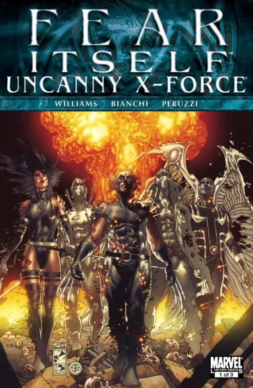
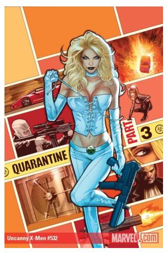
As I have mentioned (and probably could go on about it for decades, I’m sure), is the impracticality of Emma Frost. As you may already know, I am a huge fan of the X-Men and X-related comics. I read everything available from them. In one of the most recent X-Comics (X-Men: To Serve and Protect #1), Emma Frost is in a beauty salon getting herself all prettied-up when Mandrill shows up and tries to seduce women to go out with him.
Emma steps in and states that women are not to be seen just for sex and gives Mandrill a run for his money. The whole irony is that Frost is at a salon – starting off in the story naked – no doubt. Obviously there is a huge contrast to Frost’s hypocrisy in the story, but it is not focused on.
Taking a look at Emma Frost above in the cover of Uncanny X-Men #532 (to be released in a few months). Now, I’ll take a look into Emma Frost inside The Marvel Comics Encyclopedia (2006, pg. 104). Emma’s height is 5’10”, and her weight at 125 lbs. To quote Jim Carrey in Liar, Liar, “Yeah. In your bra.” Admittedly, those “facts” from the book are ludicrous.
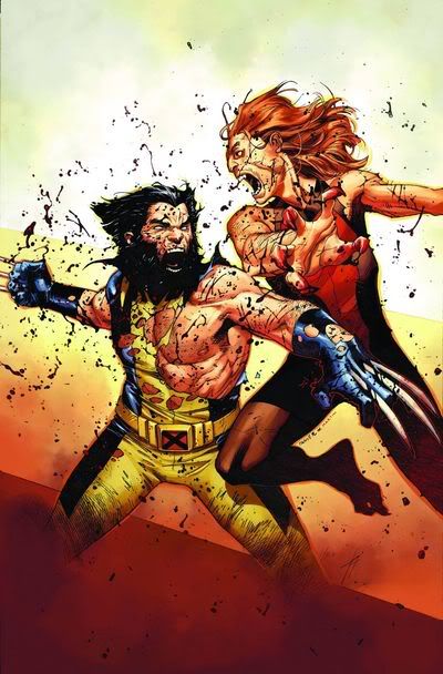
Let’s take a look at Cable now. He’s probably a fan-favourite for most X-fans – heck – most comic fans love Cable. He’s just so awesome. Look at him! I mean, he’s not going to take crap from anyone! He’ll kick anyones butt! Alas, he’s also an impossible person. With all that gear on him, plus his physique, he has no problem running or walking, nor do I ever recall him getting exhausted from running with that gear on in the comics. Deadpool on the other hand has more definition to his body than a dictionary – where his body may be proportionate to his size, his muscles are only too-extreme for his physique and only weighing 210 lbs at a height of 6’2″ (2006, pg. 76).
I’m sure no one is going to turn to their significant other and say, “Look more like Emma Frost,” or “Beef up like Cable,” but these people are meant to be icons in a world where their stories are a vehicle for commentaries on the world. These characters are meant to be voices to the masses – whether it be to tell the story or to represent a message or value. Yet they are dwindled down to eye-candy or impracticality – arguably taking away any message the comics have. (And case-in-point with X-Men: To Serve and Protect #1).
But EVERYONE? Really?
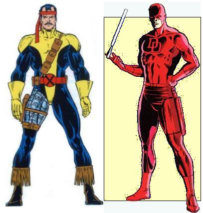
Some comic characters are just fine with who they are. I mean, take a look at Dardevil below. He is in great shape for what he does, and it is not really exaggerated unless the artist wants to explode him with huge muscles. But traditionally, below is how everyone pictures Daredevil. Then there is Forge. He has never been considered a physically strong man and works primarily within sciences. As such, he has never been overly muscled for a male character.
We can physically see a difference between the realistic views and the ridiculous ones. What I am trying to get at is that we as a society can recognize sex in ads and condemn them for being too racy. We like comics to be our voice over many issues, yet a lot of us sit back and get bombarded by hyper-sexualized characters within comic books and still may argue that it is fine.
It’s in real-life
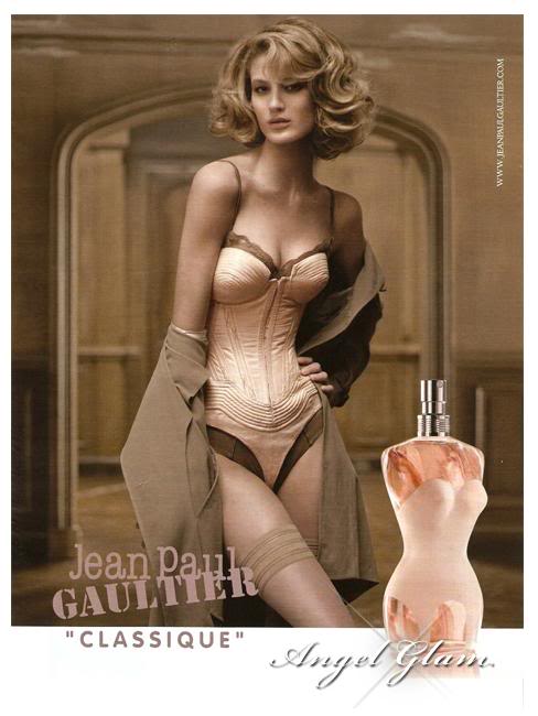
For another case-in-point, let’s take another look at that cover with Emma Frost on it, followed by this ad from Jean Paul Gaultier apparently selling perfume. Is there really much difference between the two?
It is pretty crazy. Yet we’ll be the first to condemn that ad before we even think twice about the comic book, for the most part. And that’s just the comic cover.
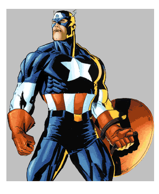
But women aren’t the only gender sexualized in comics. (Given there’s only one other gender, I’ll leave it to you to guess who else is sexualized.)
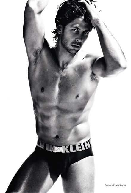
And Captain America’s is someone to look up to. He is a hero by definition. Looking at the Calvin Klein ad, a “MAN” is defined as a parallel to how the model looks in the ad. The image is uncanny to Captain America, or even Superman.
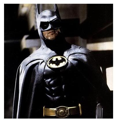
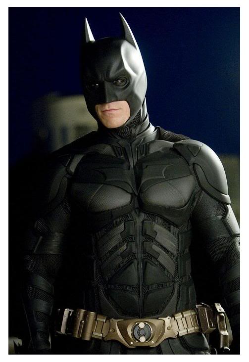
Even as the years have progressed, what a “man” should look like has became more and more over-the-top. Let’s take a look at Michael Keaton in Batman from Tim Burton’s 1989 movie and compare it to Christian Bale’s Batman in The Dark Knight – Christopher Nolan’s 2008 epic. (You can click the pictures for a closer look on both.)
Note how Keaton on the left is less-defined than Bale on the right. The muscle mass between the two costumes are both ridiculous, yet the Bale costume becomes more-than-necessary.
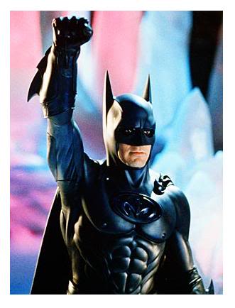
And sure, perhaps you do not recognize the subtle differences between the characters. Perhaps you do not care whether or not you can see George Clooney’s Batman nipples. Maybe you even think that I am over-exaggerating this too much.
All I see is a problem though. People love being superheroes or villains. People look up to Spider-Man and Wonder Woman as icons who will save the day. And yes, readers of comics look at stories not solely for their comments on real-world events, but also for the entertainment. I’m sure the characters are drawn the way they are because it also sells. Sex sells, so comics can too.
But do they have to?
Unfortunate conclusions
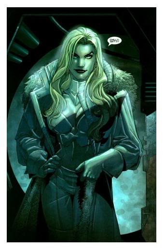
I mean, we can have great stories without hyper-sexualized characters. I doubt X-Men would have a lesser fan-base if Emma Frost wore a parka for the entire run. Oh wait, she tried in X-Men #166 from 2005, and it totally defeats what I just suggested. She’s saying, “Chilly, isn’t it?” (It took me a long time to remember which issue this was in).
Do we need comics to be like this? No. Do we want comics like this? Some of us do, probably, yes.
But ultimately what do these characters serve the way they are? A hypocrisy in our thinking? Is it sexual deviancy? Is it a degradation of our society? Does it objectify people? Does sexuality make the characters more prominent? Does it matter what the superheroes are wearing?
Maybe all of the above or none of the above.
The fact is that it is still there. Where the world in comics is a parallel to our own real world, perhaps their physical perfection is simply a mimicry of our fallacies as a society.
Maybe their falseness is a contrast to our reality?
I also know I’m not alone in these feelings. Two blogs I read regularly will often times bring up the idiocy of comics when it comes to the portrayal of body image.
This week, I had only planned on picking up two comics. However, I completely forgot about – despite all the marketing – that Chaos War started today. As such, here are my reviews for two major-titles this week: Uncanny X-Force #1, and Chaos War #1.
These reviews may also contain spoilers.
Probably the most anticipated book since X-Men: Second Coming story arc, Uncanny X-Force blew into comic stores today, and I must say, did not disappoint. Written by Rick Remender with art by Jerome Opena, UXF delivered quality story-telling with superb art, and wonderful direction.
X-Force disbanded at the end of Second Coming earlier this year, with Wolverine re-assembling it under the nose of Cyclops. The roster features Archangel, Psylocke, Deadpool, and Fantomex, as they are on a quest to finally kill Apocalypse once and for all.
The story kicks off with some Deadpool heroics which sets up the rest of the story. My primary concern with the story would be separating both voices of Deadpool and Fantomex as I found both characters to be some-what the same in their humour and actions. I only felt this way as Bendis in the Avengers parent-title, has seemed to merge both Spider-Man and Hawkeye as one voice. However, this was not the case with Remender. We actually have two unique people adding significant character into the story. It was relieving to me.
The story goes into Archangel and Psylocke’s relationship and their concern for if “Death,” Archangel’s secondary mutation from Apocalypse, could take over. Although it was never really discussed in the prior X-Force comics, I can see how we are already being set up for future story arcs. I’m ecstatic. Plus Betsy and Warren are together. I love it.
Wolverine surprisingly does not have much to do with the main set up as the story. As the founder of X-Force, and it’s longest-running member since it’s most recent conception back in Messiah CompleX days, I can understand why they did not need to focus so much on Logan.
However, what the story does for the reader is wonderful. Brilliant colours and tones flush the pages, thanks to colourist Dean White. The comic has a mixed feelings of haze and impending doom with each turn. Opena’s art also stands out as nothing but spectacular. Wolverine versus a stone giant – who would not love it? Plus a wonderful final-page ending that leaves us all with “wtf” moments certainly will have us back for issue two.
Uncanny X-Force exceeded expectations and pushed out a grand story (with tons of variant covers) which will go down in to the comic history books.
Grade: 10/10
Chaos War is something Marvel has been teasing us with for awhile now. Since the death of Hercules and his sudden return, I know I have been asking myself, “why kill him off only to bring him back months later?” Chaos War is the reason why – and I believe that the killing-off/bringing-back formula worked well for this comic.
Written by Incredible Hulk great Greg Pak, and Fred Van Lente, Chaos War begins with King Chaos killing Nightmare in his realm and taking it over, showing us what sort of power the King possesses. It is followed by Hercules’ return to Earth – warning its heroes of the impending doom the Chaos King will be soon bringing to the planet. What is really good is how Pak and Lente show how all the heroes react to Hercules’ return – not considering it relevant as Herc has always been considered a buffoon. Not this time.
Hercules returns alive from an alternate universe with immense power, given to him by his best friend, the Prince of Power, Amadeus Cho. Teaming with Thor, Spider-Man, the Avengers, the Fantastic Four, and many others, Hercules divides his new-power between all the heroes and brings them up to Nightmare’s realm to stop the Chaos King. So begins the Chaos War.
The story, I would consider to be a building up immense destruction. Although the main story is only a five-issue run, there will be plenty of one-shots and limited-series connected to the Chaos War, such as Dead Avengers, Alpha Flight, and Dead X-Men. It will be interesting to see how it all ties together. However, the story itself revolves around the re-building of Hercules’ character and the convincing of all other heroes that he is not the imbecile he once was. That’s fine. It was done well. However, I felt a lot of filler in the story, such as an unnecessary battle with other gods. Although I can understand they were added for showing us the severity of the Chaos King – we did not need the mini side-plot.
Khoi Pham’s art though, should not be over-shadowed. Great detailing with Hercules, as well as Nightmare’s realm, really stood out as two unique points in the book. Nightmare’s realm being a disaster zone with death and chaos, was greatly drawn and I could personally feel the horror within the realm. And with Hercules, his body, his face, everything was immensely detailed and clearly displayed. Why I only say Hercules is because I felt as if the rest of the characters were somewhat thrown into the story at the last second. Once panel shows all the heroes flying upwards to Nightmare’s realm, and it is clear that only Hercules had the most attention put on him. I digress. . .
Chaos War will be an immensely popular series, I’m sure. It involves most of the Marvel U and is argued to be better than the Infinity Gauntlet storyline. Where this will take us, I do not know. But I am interested to see how it will be executed.