The Biased List: My Top 15 Favourite Uncanny X-Men Covers

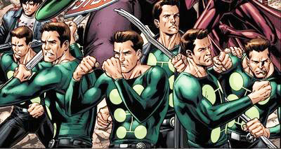
Let’s talk about some comic book covers from the Uncanny X-Men series.

If it wasn’t obvious from the title of this website, the X-Men have had a pretty monumental impact on my life. I grew up reading the comics, watching the cartoon show, and harshly judging the films. More recently, I’ve even gone as far as to compile a fantasy X-Men team because this boy can dream!

While there’s plenty of X-Men books to talk about: from the Uncanny X-Men, Astonishing X-Men, Amazing X-Men, Generation X, X-Force, and so on, I wanted to sit down and discuss my all-time favourite Uncanny X-Men covers.

While the stories are ultimately what sold me on the X-Men, covers were really the selling point for people to pick up comic books. For example, Batman had to be doing something cool for someone to want to read his stories and not just think of him as some guy in a bat suit. And while there’s tons of X-Men to choose from, having the most popular X-Man, Wolverine, on the cover would be sure to drive up sales. A cover without Captain America fighting the Red Skull would be more awesome to pick up and read than one with him versus Batroc the Leaper, y’know.

Literally judging books by their covers isn’t my plan with this list however. I want to talk about the artwork and what about the cover draws me in. Colours, details, storytelling – what the cover says rather than what it’s selling. So here goes:

Some Honourable Mentions

Uncanny X-Men #525, Aug. 2010 (Cover by Adi Granov)

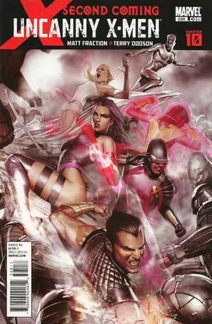
Six X-Men under siege by robots may seem like a typical X-cover (which we’ll see more of later), but this really gives us a sense of dread. The grey palette contrasting against Armor’s, Psylocke’s, and Cyclops’ reddish-pink weapons give a nice pop to the page. And Namor’s face though.

Uncanny X-Men #213, Jan. 1987 (Cover by Alan Davis & Paul Neary)

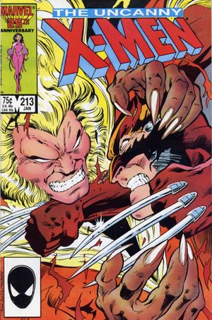
I considered adding this cover to my main list, but felt that the impact of this cover is actually more nostalgic feeling. I say that because at this point, nobody knew who Sabretooth was, let alone his history with Wolverine. However, the cover is action-packed and claustrophobic, especially considering how few colours are actually used on the page. It’s as if we’re in hte fight with them. One helluva great inking job too.

Uncanny X-Men #251, Nov. 1989 (Cover by Marc Silvestri & Dan Green)

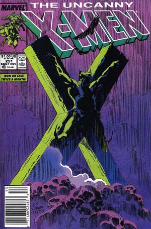
I love me some Silvestri, which is why it pained me to leave this cover only as an honourable mention. In typical Silvestri style, we have lines, lines, and more lines running down the page, giving this Biblical representation of Wolverine’s crucifixion an incredibly sombre feeling. The green back-lighting against the crucifix is stunning.

Now the list:

15. Uncanny X-Men #476, Sept. 2006 (Cover by Billy Tan, Danny Miki, & Frank D’Armata)

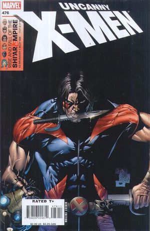
While it’s definitely not the most action-packed cover on the list, this solo cover of Warpath stands powerful for me as it really speaks to his character. Out of the shadows, both literally and figuratively, comes Warpath with his Vibranium Knives and the head of the enemy. Figuratively speaking, he’s the little brother of the fallen X-Man, Thunderbird. Outside of Cable’s X-Force books, Warpath was a thrown away character lost and forgotten about. This cover for me represents his coming-of-age in the Uncanny X-Men – a bigger book than X-Force. With this one cover, without any dialogue, the viewer is given everything they need to know about Warpath.

14. Uncanny X-Men #205, May 1986 (Cover by Barry Windsor-Smith)

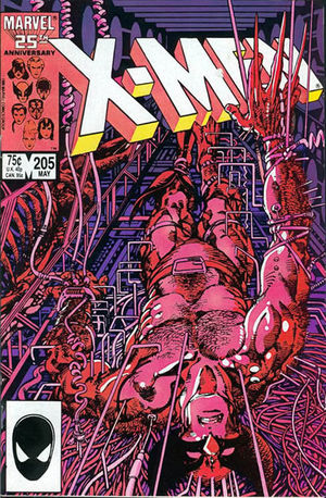
I couldn’t have a X-Men cover list without the legendary Barry Windsor-Smith on it, could I? The detail and confusion for the viewer on this cover is shared with Wolverine’s expression. The helplessness of both the viewer and Wolverine trying to figure out what is happening. The lines, wires, and colours all give a threatening feeling. It’s uncomfortable to see, let alone to understand. It’s a beautiful mess. Wolverine’s right hand – his claws extended as if they were forced out of him – add to the feeling of dread. Much like the cover, this issue is messy, violent, and mechanical.

13. X-Men #61, Oct. 1969 (Cover by Neal Adams & Sam Rosen)

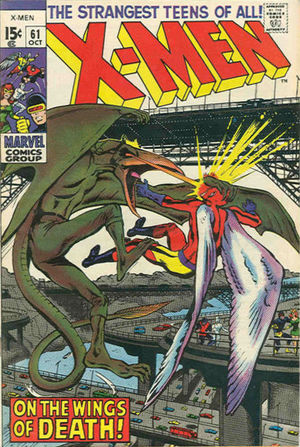
The second appearance of the X-enemy Sauron lands in my top 15 list as it really encapsulates the threat of Sauron. An incredible landscape within a busy city adds to the sense that the public isn’t safe. Up in the air, Angel is alone against Sauron as the rest of the X-Men helplessly look on: they can’t fly! How can they save their friend? Sauron’s size engulfs the page and yet surprisingly his monotone green body doesn’t feel boring. What is he to the viewer? The grey city below doesn’t help with colour variety – yet the cover pops out with the bland green and grey as the dominant colours in the cover. How did Adams and Rosen pull this one off?

12. Uncanny X-Men #395, Aug. 2001 (Cover by Barry Windsor-Smith)

Fifteen years after our last entry with him, Barry Windsor-Smith still dominates the X-books with another favourite of mine as both a cover and an X-Man. Jumping over from the Generation X books, Chamber dominates with his literal explosive power taking over the cover, despite there being very little action at all on the page. His eyes scream attitude, almost as a “screw you” for his Gen. X series being cancelled. With his head slightly tilted, it’s almost as if he’s asking, “Are you talking to me?” as he makes his mark. The cover is bright, bombastic, and the lettering compliments – if not helps – the impact of the cover. A great premise behind the cover’s simplicity.

11. Uncanny X-Men #268, Sept. 1990 (Cover by Jim Lee, Scott Williams, & Tom Orzechowski)

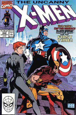
The only Jim Lee cover on my list. It’s my favourite for a few reasons: firstly, it’s an iconic cover. Three big names in the Marvel Universe together on one cover and “together again for the first time.” Secondly, their stance and dominance on the page make the viewer forget the trio really aren’t anywhere. There’s a city in behind, a bridge, and. . . steps? The trio seem to be looking off at something – are they above it or at eye-level? It really doesn’t matter because we focal point of the cover draws us away from the background’s strangeness. The viewer is forced into seeing Captain America’s chest and shield, then Wolverine, then Black Widow. The distinct colours and inks wonderfully make your eyes circle along with the figures – only to circle back around from Black Widow’s head into Captain America’s chest and shield again. Repeat. It’s truly a great cover, if not a bit clever, cover.

10. Uncanny X-Men #290, July 1992 (Cover by Whilce Portacio)

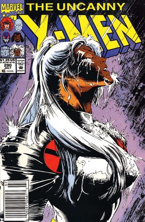
Making a graceful cover even more wonderful is Whilce Portacio’s Uncanny X-Men #290. Here, Storm stands literally and figuratively in her element(s) as few colours are used to define the image. Heavy on the inking to define the white space and rain, the viewer is left uncertain on whether there are tears running down Storm’s face or the rain. The cover is a simple idea which is manifested into something much more grand with Storm’s body language suggesting either relief or joy. She stands in front of the X-Men logo, making sure she is the focal point for the cover. Everything else is secondary.

9. X-Men #137, Sept. 1980 (Cover by John Byrne, Terry Austin, & Jim Novak)

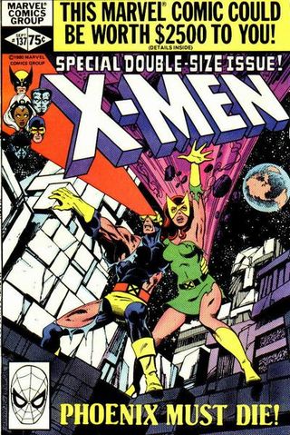
Blunt and to the point: Phoenix must die! With their backs against the wall on an alien planet (notice Earth in the background!), the X-Men are in for the fight of their lives to save Jean Grey. Cyclops and Jean holding on to one another while fighting off the enemy (or in this case, the Shi’ar could be considered good guys?), in a battle to the death. Words do a lot to sell this issue. “Special Double Sized” and “MUST DIE” really stand out as a selling point – to a lesser extent earning $2500 sounds great as well, but that’s besides the point. However, there’s a bit of a throwback in this cover. We have Jean back in her earlier costume, giving bright composition to the dreary background. She’s front and centre on the cover, both her and Cyclops launching weapons at an unseen foe. Lots of mystery and intrigue is given on this cover (and what happens inside the book is a doozy!)

8. Uncanny X-Men #207, July 1986 (Cover by John Romita Jr. & Dan Green)

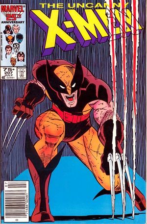
A simple cover still reeling with incredible action. Wolverine ripping the cover he’s contained in? Talk about breaking the fourth wall. This cover is so basic, but feels like there’s a lot going on. Straggly vertical lines; little details on Wolverine’s otherwise boring costume colours; the pose. I like this cover because, to paraphrase physicist Lawrence Krauss, it makes something from nothing. What could be a ho-hum cover by Romita Jr., ends up being one of the most iconic covers featuring Wolverine.

7. X-Men #101, Oct. 1976 (Cover by Dave Cockrum & Danny Crespi)

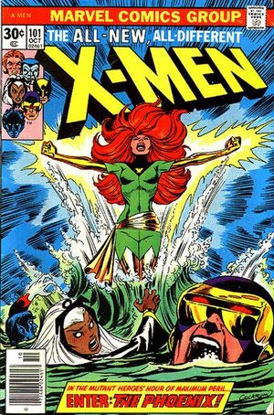
Speaking of iconic covers: the first appearance of the Phoenix certainly is one! Cyclops drowning, Nightcrawler struggling to swim – Storm seems as if her cape is weighing her down, yet still looks over to help see Cyclops in danger – the fear the cover strikes is enormous. Given it was only a few issues earlier where X-Man Thunderbird died, there’s still a chance for any of the main members to go as well. Cockrum was so far ahead here, one can even see the fear in Cyclops’ eyes through his visor. Much like issue #137, we have another bright green Phoenix cover, contrasting against Jean’s red hair and the blue sky – lots of colour composition is happening here and the characters seem purposefully chosen to make the colours work. And not to mention the impact of Jean’s explosion out of the water. It’s just one big “wow.”

6. X-Men #133, May. 1980 (Cover by John Byrne, Terry Austin, & Gaspar Saldino)

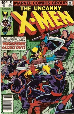
So about those iconic Wolverine covers. . . often considered to be one of the best Uncanny X-Men covers, Wolverine taking on the Hellfire club soldiers helped define his character. Clearly out-manned, alone, and forced into melee combat against armed combatants, Wolverine simply kicks some serious ass. Keeping mostly primary colours: red, green, blue – and yellow, the individual characterization of each person on the cover really shine. The fearless shooter from a distance; the annoyed soldier behind Wolverine, the three goons getting knocked away and whose pain the viewer can actually feel because the bodies aren’t in unusual positions – this cover, “delivered” by John Byrne and Terry Austin, not only defined the X-Man, but helped define the series.

5. X-Men #98, April 1976 (Cover by Dave Cockrum & Gaspar Saldino)

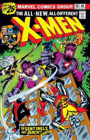
One could say that battling giant robots could be considered the X-Men’s forté. The giant Sentinels literally tower over the X-Men, leaving the dynamics to this cover to be in the hands of the legend, Mr. Cockrum. We only really get an idea of the scale of the Sentinels by Wolverine and Cyclops, making the fall of Colossus from the building that much more dramatic. Lots of action sprawls over the cover with every X-Man doing something relevant on the cover (which is a thing older X-books had a problem with – see my #3). The purple of the Sentinels compliments the strangely green-lit background featuring a Kirby Krackle sky. In my eyes, if there’s one cover that screams “The X-Men,” this would be it.

4. X-Men #141, Jan. 1981 (Cover by John Byrne & Terry Austin)

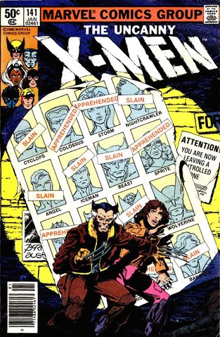
Everyone’s dead! In a dystopian future, we have an older Wolverine and Kitty Pryde up against a wall with their friends – and all of the characters we’ve read about – all apprehended or dead. It’s a dark, dreary cover for the X-Men which actually reflects the storyline contained within. It’s gritty and reeks of fear and anticipation. Who’s after Wolverine? Who has killed them all? How will anyone survive? Looking at this cover to this day, I still imagine what happened to the X-Men who were captured or killed. The cover gives more questions than answers and begs the reader to pick up the book.

3. X-Men #12, July 1965 (Cover by Jack Kirby, Frank Giacoia, & Sam Rosen)

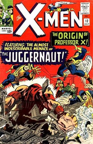
I bet some of you were asking yourselves when the Kirby representation was going to appear. X-Men #12 takes the cake for me as his best X-Men cover as we witness the first appearance of the mighty Juggernaut. His explosive entrance to the cover (and the series) knock back the X-Men – save for Jean Grey which Kirby never seemed to know what to do with on his covers. But what works well for this cover is a few things: the mystery behind the Juggernaut. We see his back, a gigantic fist, huge shoulders – what sort of creature is he? The cover is bright and red; instilling fear and drama on the cover. It makes the X-Men’s yellow costumes pop out, which in-turn also adds to the dramatic feel to the cover. There’s nothing happy happening here. It’s dark, obstructing, and moody, not only making it a really strange cover for its time, but one of my favourites to go back and look at.

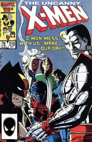
2. Uncanny X-Men #210, Oct. 1986 (Cover by John Romita Jr., Bob Wiacek, & Danny Crespi)

Alright, alright. I’m sure you folks are wondering why this cover is so far up on the list. The real reason is that this cover totally hits the mark of the “definitive X-Men lineup” for me. While the catch phrase on the cover is cheesy as all hell, it’s the body language the X-Men give off that really strikes me. If you were to gauge the X-Men on their covers, to this point, save for issue #141 (and its next issue), it would’ve felt like regular comics for all ages. This cover was the turning point in the books for me, featuring the Marauders and a lot of dead Morlocks. The following covers feature blood, violence, fear, and action – but all originate from the storyline in this book – based off of the attitude from these characters. I wouldn’t want to mess with any of the X-Men based on this cover. They’re fearful, they’re menacing, and most importantly, they’re the best mutants for the job. Much like issue #207, Romita keeps it simple with a plain background and some horizontal lines to give this cover the edginess it needs to really hit home.

1. Uncanny X-Men #142, Feb. 1981 (Cover by Terry Austin & Danny Crespi)

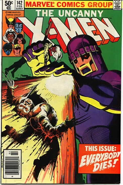
Like I said before, save for issue #141 and its next issue, the X-books felt like comics for all ages. Then comes along Uncanny X-Men #142 by Terry Austin and all hell breaks loose. A giant Sentinel obliterates Wolverine on the cover as an impaled and broken Storm looks on. In this issue, EVERYBODY DIES. It’s a gut-wrenching cover for anyone to gaze upon. The action – and Wolverine’s death – demands your attention. Eyes focus on the colourful composition of his face. Just based on colours alone, everything compliments one another – green goes with purple which goes with yellow and orange. It’s inked beautifully to mask the real gore behind Wolverine’s death. It’s like the old horror movie trope: it’s better to have the murder done off-screen to leave the gruesome details to the imagination. And Wolverine’s death being caused by a soulless, faceless machine makes the hit so much stronger. As far as Uncanny X-Men covers go, this one delivers.

So that’s it! That’s my list of my favourite Uncanny X-Men covers! I’m sure a lot of you could agree with my choices, but I’m certain a lot of you would disagree with what I’ve said or my selection.

What have you? Did I overlook a cover? Let me know below! Or you can let me know on Twitter and Instagram!

Until next time, keep on Space Truckin’!

The Dream X-Men Team

Man, I love me some X-Men. I grabbed my first issue back in 1994 and was hooked from there: indulging myself in the world of X ever since. I’ve watched many teams break up, reform, or take turns becoming “Uncanny” in various ways. I’ve seen X-Men both die and come back to life, join other non-X-related teams like the Avengers, or became enemies against their friends. It’s been a wild ride.

Author Kelly Thompson recently retweeted a link from Comics Alliance which featured an X-Men Fantasy Draft. While some of the teams are great (like Katie’s and Aaron’s choices), I thought I should probably showcase my own.

While there’s well-over 300 X-Men to choose from, I’m going to limit myself to ten. I know the folks over at CA capped it at 8, but I’m making my own rules. And now, in no particular order:

moonstar1. Mirage (Danielle Moonstar)
Part of me hates that I have to explain why I’ve chosen Moonstar when I know she speaks for herself. Not only is she a quality leader, she’s still a complete bad ass even without her powers. On more than one occasion has Moonstar been the voice of reason, keeping her calm and head in the game when things get rough around her. She seems to always be there for someone even when her own life seems to be in shambles. Empathetic, compassionate, and yet still tough as nails, easily proven when she took on Hela herself. A natural, gifted, and talented member – an obvious choice to be on the team.

2. Archangel (Warren Worthington III)
For the record, I’m referring to the original Worthington, not the new one brought up through time travel (like I said, it’s been a wild ride). I’ve always had a soft spot for Worthington as he’s not only an emotional basketcase that I have sympathy for, but also still clear in mind to help his friends when needed. Despite turning against his friends time and time again, his heart (and fortune) is always in the right place.

warren_worthington_iii_earth-616_0033

One of the original five X-Men, Archangel has always been a background character of sorts. While his powers of flight aren’t as aggressive as Cyclops’ optic blasts or Wolverine’s claws, they keep him cautious and clear headed in action. That is, unless the Archangel takes over. . .

monet3. M (Monet St. Croix)
I’m always a big fan of confidence. M oozes it. Her confidence is backed by her mutant powers of strength, flight, healing powers, and telepathy – essentially “perfection.” She’s a super-smart one-woman show who, as I once reviewed, doesn’t take crap from anyone. Originally with the Generation X team, she later grouped with X-Factor to showcase her investigative side and how she works in more intimate, adult groups. My only beef with having her on the team is that a lot of the other members would have a hard time putting up with her attitude. While it’s not usually warranted, it makes for some great stories.

4. Chamber (Jonothon Starsmore)chamber

Another character originating from Generation X, Chamber has always struck me as a tortured soul – unable to eat, breathe, and speak like a normal human, Chamber’s lower jaw was destroyed by his mutant powers when they first manifested. The energy that flows within his jaw can be controlled, giving him immense power and making him a formidable X-Man.

I first really understood Chamber when picking up Uncanny X-Men #395 (which also features a great X-Men roster) and reading his development as a character. I grew attached to him from there and been a big fan of his ever since.

5. Multiple Man (Jamie Madrox)mm

If I am ever given the chance to write an X-book (Marvel, are you there?), I would NOT use Jamie Madrox. This is simply because I believe he is author Peter David’s character. David’s work on the Multiple Man over his long run of X-Factor showcases character development and dedication to both a story and character arc. Multiple Man always struck me as Joss Whedon’s Captain Malcolm Reynolds from Firefly before Firefly was even a thing. Madrox’s humour, strength, tenacity, and struggle with leadership makes him the most human person on the team. But, oh man, his powers would be so freakin’ useful. (And once upon a time I went as Multiple Man for Halloween).

6. Domino (Neena Thurman)

dominoFor the uninitiated, Domino may seem like the mutant version of Black Widow – but with a luck on her side. Quite literally. Domino’s powers of shifting the odds in her favour not only make her a terrifying force to be reckoned with, but a incredible asset to any team. Originating in X-Force, and then later in a new X-Force, only to be put into another X-Force after that, Domino knows a thing or two about sneaking around, combat, and making stealth a priority.

While some of her snarky attitude and over-confidence may mirror M’s, Domino knows when to duck out if things get too dicey. She’s experienced, tough, and yet will stick to her guns (literally, too) if something doesn’t seem right. It also helps that she’s also worked with my next pick!

7. Boom-Boom (Tabitha Smith)boomboom

If your idea of Jubilee comes from any of the X-Men cartoons or movies, think of her near-opposite and you have Boom-Boom. While Jubilee was the hip teenager who wanted to go to the arcade and chew bubblegum, Boom-Boom was out hunting for boys and blowing stuff up. Her mutant power – creating ticking time bombs made out of plasma energy – can explode with great force. While working with both X-Force and X-Factor, she has never really been written as a fully-matured character. While that may be a turn off for some folks putting together a team, Boom-Boom still has it where it counts and her light-hearted attitude and spirit would make for easing tension and energizing the group.

8. Fantomex (Jean-Phillipe/Charlie Cluster-7)

fantomexOne-part James Bond, one-part Wolverine. One-part three brains. What.

Fantomex is a creative secret agent out of the Weapon Plus program that uses his powers for confusion and escape more than anything. If there’s one thing that Fantomex does do, however, is make himself look good to others by getting the job done. Whether it be him single-handedly saving Uncanny X-Force from the Horsemen of the Apocalypse, or managing to make The World work in his favour, Fantomex’s bag of tricks seem to be limitless as he (and trusty E.V.A.) are a tag-team of terror. Fantomex’s only real challenge being on the team is my next choice. . .

9. Psylocke (Elizabeth Braddock)psylocke

Psylocke is a character which many authors struggled to understand (and even more artists struggle to draw properly). Explaining her origin would take longer than what you’ve read here so far, so let me leave you with who she is: a psychic ninja assassin with more baggage than most people. One would think that being on another team with two men she has dated (Archangel and Fantomex) would mean trouble – and you know, it probably would. But she doesn’t let things linger or bother her for long – pushing emotions aside to finish the mission. Psylocke has been a tremendous force in the X-Men for many years – her devotion to the team and making things right is part of her moral code. The soft-spoken ninja never needs to prove herself because she lets her actions do the talking.

10. Banshee (Sean Cassidy)

At the end of my list, we have the leader of Generation X and the only (currently?) dead X-Man. While the movies (or failed TV pilot) don’t give Cassidy any justice, he is totally on my list because he is probably one of – if not the most – experienced character in the roster. He’s seen his fair share of action as he’s been in the X-books since the 60’s. He’s lost his powers by damaging his vocal chords when saving Japan from tremendous waves (caused by a villain). He founded X-Corps: a short-lived mutant police force. He’s been a detective with Interpol. He’s a father. The list just goes on. Noble, honest, and self-sacrificial (I mentioned he’s dead, right?), Banshee would be the most likely to lead my fantasy group of X-Men.

My honorable mentions go to: Captain Britain, Juggernaut, Polaris, Rogue, and Nightcrawler.

So that’s my list! Do you agree? Disagree? Do you think there would be too much drama or that everyone would be mature enough to get over it all?

And what about you?! Who is on your X-Men dream team? Heck, who is your dream team of superheroes? Sound off below!

And keep on Space Truckin’!

About that new Mary Jane Watson

In case you’re unaware, there’s a new Spider-Man movie coming out! It features Tom Holland as Spider-Man, an actor you’re probably now most familiar with since seeing him in Captain America: Civil War.

Since the set up of Spider-Man in Civil War, the audience got a bit of a taste on what to expect for the new Spider-Man movie, scheduled to be released in 2017. What some people weren’t ready for were the casting choices.

Since this is the third reboot of the Spider-Man film franchise, all of the characters were to be recast. Of all of the casting choices, having Zendaya Coleman cast as Mary Jane Watson – Peter Parker’s girlfriend/eventual wife – caused a bit of an unexpected uproar.

Mary Jane's first appearance.
Mary Jane’s first appearance. Her actual person would not be revealed for another 17 issues.

Personally, I never had heard of Zendaya before the casting announcement. And to be honest, I still really don’t know who she is. A quick IMDB search shows she’s been in a lot of Disney stuff, but that’s about it. I’ve never seen her act as I don’t have cable, Netflix, or watch any Disney television shows. I was going in blind upon hearing the casting announcement.

When I heard of the casting choice through ComicBookResources, I saw a picture of her and moved on with my life. It was another actress hired in another role. I’m excited for the outcome but cannot pass any judgment on an actress whom I’ve never seen work before.

What I didn’t expect was the reaction from some Spider-Man fans.

Over social media, some Spidey fans cried out about the casting choice saying Zendaya is not what they want in their Mary Jane. I know this because I bore witness to this outcry on a friends’ Facebook page:

Comment3

Is it that hard to understand that the colour of someone’s skin does not have to be the definition of a character? Mary Jane being a Caucasian redhead was never really an integral part of Mary Jane. Sure, she was nicknamed “Red,” but if she was blond, it could’ve easily been “Blondie.” Either way, a nickname that a writer creates for a character is not an integral part of that character.

In fact, all of the physical attributes this person on Facebook makes are solely based on the physical appearance of Mary Jane – not who she is as a person. From no storylines can I recall how her skin, eye colour, or hair colour were important to the story. She’s not Medusa from the Inhumans. Mary Jane’s hair isn’t that important to the character, let alone the colour of it.

And spoiler alert: hair can be dyed.

Comment2

Is it racial diversity or is Zendaya just a good actress? Mary Jane can be whomever she is cast as. Skin colour doesn’t define the role. The written characterization, the actress doing her job, and the storytelling is what defines Mary Jane.

Comment4

How does Zendaya not fit the character? The movie isn’t even out yet. There’s prejudice in these words as they make assumptions without any base to support them.

Comment5

Is it really that your fandom is being changed? Or is it that your “picture” of Mary Jane is being changed because we’re no longer in the 1960’s and people of different backgrounds and colour are finally starting to get equal representation in the comic book medium?

As of late, Marvel has made some major strides to become all-encompassing with their characters. Thor is now a woman, Jane Foster; Ms. Marvel is a Pakistani-American named Kamala Khan; Amadeus Cho is the Korean-American Hulk; Riri Williams – a black woman – is going to be the new Iron Man named Ironheart, and let’s not forget Miles Morales as Spider-Man.

The comic book industry is shaking up and changing in some major ways. Sometimes it’s hard to remember that a lot of the major comic book characters we all know and love were created in the 60’s and 70’s when minorities did not have a voice in the comic book medium. Strides were being taken, such as Storm’s introduction in ’75, or Luke Cage in ’72, but arguably neither of those characters are “big league” characters like Captain America or Thor. But now we have a Luke Cage TV series coming out soon and the Black Panther movie is slated to come out in 2018.

It’s a changing landscape and it’s wonderful that it’s happening. But when Marvel takes a character like Mary Jane and change the colour of her skin, suddenly it’s the biggest deal on the planet?

Twitter1

Right, because Martin Luther King is a fictional character. . .

Twitter3

Hrrrrrnnnngggghhhhh.

Twitter2

That pretty much sums up the hypocrisy of it all.

Look, if you’re freaking out over the colour of someone’s skin because your fictional character no longer looks the same, then you haven’t been enjoying that character as a character. You’ve enjoyed their looks and therefore never really cared about the character at all.
Think about it.

Agree or disagree? Let’s chat in the comment section below.

Getting Your Comic Book Signed: Good Move or Bad Idea?

Collecting comics can be a pretty fun, if not costly hobby. It requires keeping up with current market prices as well as the know-how of what makes a quality book.

A lot of that weighs heavily on the cover. Having an original, un-restored version of the book cover is important, along with it having vibrant colours. Also having a cover fully intact improves the overall price of a book.

But what about when a creator signs a book? What happens then?

Surely if you have a copy of Captain America #1 signed by Jack Kirby, you’d be sitting on a goldmine, right? What about a copy of Showcase #22 featuring a signature from Gil Kane?

Chances are the book would actually be worth less money.

Before you start shouting at the screen or balling your eyes out, let’s find out why – and see if you can do anything about it.

A lot of this hooplah about the quality of the book degrading over a signature can be somewhat blamed on the company, the Certified Grading Company, or “CGC.” For a more in-depth synopsis of CGC, check out what I wrote about them in the past.

CGC Hulk 340

But if you wish to keep reading, I’ll make it simple: CGC is considered the best of the best when it comes to grading comic books, magazines, cards, and many other types of relatively-flat, printed collectibles. If you get your book graded by CGC, chances are the price of your book can increase by a significant margin.

Considering there are a lot of scams within the comic book collecting hobby, CGC are widely considered the number one place to go to get the “truth” behind a comic book. Through their grading process, they have experts in restoration check to make sure the book is in its original form. From there, they will go through the entire book to guarantee the book is up to par and not missing any pages. At the end of the evaluation, they assign a grade on the book from .5 (Poor), to 10 (Gem Mint).

CGC will then put the book in a transparent case (or “slab”) along with a coloured label to tell the viewer what kind of book they are looking at. Blues are the most common as they represent basic, graded books. A Purple banner means the book has been restored, while a Gold banner means it has an authentic signature.

While I could write different stories about the other banners (which you can read in that blog I mentioned earlier), it is the Gold banner we’ll be focusing on. The Gold banner stands for the “Signature Series.”

Because CGC has become a staple in the grading process, the general comic collecting community has agreed (somewhat – but that’s also a whole other article for another day) that what CGC says is authentic and thus the books should be sold as such.

For example, if you have a non-CGC graded book (or an “unslabbed” book), it may only be worth $50. However, if you get your book slabbed, it may suddenly be seen as $100, or even more. That’s great news, no?

But with signatures, it gets tricky.

If you say, have a copy of Captain America #1 signed by Jack Kirby before his death in 1994, you cannot submit it for a Gold banner to CGC. Even if you have photos or video of the event happening, they will not consider it for the Signature Series. This is because a CGC representative was not present at the time of the signing.

To receive a Gold banner for the Signature Series, a CGC representative must be present to witness the signature. Nowadays, CGC goes to just about every major comic book convention. It’s great money for them to do it. If you get a book signed by Neal Adams or Stan Lee with CGC present, they’ll grant you the Signature Series banner. But CGC only began in 2000, with their Signature Series starting in 2001.

Any books prior to 2001 cannot be submitted for the Signature Series as a CGC representative, nor the company, would not have been present.

That being said, you can set up a CGC-approved witness for a signing by contacting the company.

CGC Buffy

So let’s get back to the slabbing of the book.

For unslabbed books with a signature, the books are considered – to many collectors – not valuable, solely because there is no guarantee who signed it. Even if you have videos, pictures, and a great story to go along with it, CGC set the standard to signature books. A collector may be hesitant to purchase a book even if you provide the proof. This is only because in their minds, they may be aware of CGC “standards” of the comic collecting industry.

So if an unslabbed book is worth $50, and slabbed it’s $100, surely a Signature Series book will increase the value even more, right?

Yet again, I’m poised to say the answer is both yes and no.

Why it may increase in value: a signed book that is authenticated by CGC is considered more valuable than a signed book that is not authenticated. The reason is that CGC guarantees the book was signed by the signer. There’s no if, ands, or buts about it. They guarantee to the buyer that the signature is real, and thus it would not depreciate the price of the book. They guarantee the signature is not just a “scribble.” It’s actually a signature by Jim Lee!

On why it’s not increased in value: sometimes you get buyers who do not want a signature on a book – that it “ruins” the artwork on the cover. Even if CGC authorized the signature, it still may not be what the buyer wants. Effectively, that signature may have just shunned away a potential buyer.

As a collector, I personally do not buy already signed CGC books solely because I wasn’t there to have the story of its signing. While yes, there would be provenance through the CGC, the provenance is not mine. Therefore I would ignore the Gold Banner and try to find the book without a signature. Sale lost!

Keep this all in mind if you’re a collector and are considering having someone sign your comic book.

Questions, comments, or concerns? Sound off below! Or you can hit me up on Twitter and Instagram! And indeed, keep on Space Truckin’!

Comic Collecting and Price Jumps!

I was visiting one of my local flea markets recently and stumbled across a copy of X-Factor #6 from 1986. This book has some significance as it is the first full appearance of Apocalypse.

I saw it bagged and boarded on the wall at this particular flea market without a price. It had a sticker on the bag stating the comic was “NM.” (For those unfamiliar with the grading system, NM stands for “Near Mint” and represents a 9.4/10 when it comes to grading quality).

I asked the gentleman who ran the booth what he was asking for it. He had the price tucked in-behind the book because, and I’m paraphrasing here, “If regular people around here saw what these books went for, they’d get stolen from me.”

He lifted the book from the wall and revealed the price.

$120 (Canadian, by the way).

I was a bit shocked at the price. But before I move on, let’s backtrack a bit here.

XFactor 6

If it wasn’t obvious from this website already: I collect old comics. It’s a serious hobby of mine, and yes, it’s an expensive one. I love to go to shows and seek out the best deals on books: to compare prices, grades, quality, and experiences with other collectors.

While I’m big on finding old Horror and/or Atomic Age books, I have a particularly personal investment with Marvel books – especially the X-Men related books.

So when I see something X-related and the price surprises me, flags go off in my head. Why is the price the way it is? Why would someone charge so much for this book? I knew the NM price from the Comic Book Price Guide: around $50. Why was this price so inflated?

Of course, there’s the newest X-Men movie: X-Men: Apocalypse. But does that mean the price can fluctuate that high?

Well, yes and no.

Demand for the book would dictate the price. While I’m not at every convention or following all of the prices for every book out there, it seems as if recent demand has suggested the price of X-Factor #6 to inflate to a surprisingly high price.

However, the book’s sudden inflation is solely based around the movie. The book is actually quite common and may only be “up” for the short people that the movie is around.

It’s not as if movies transform viewers into readers either.

I remember when Iron Man 2 was released in theaters, I saw these numbers on The Beat:

02/10 Invincible Iron Man #23 – 50,027
03/10 Invincible Iron Man #24 – 49,239 ( -1.6%)
04/10 Invincible Iron Man #25 – 73,694 (+49.7%)
Iron Man 2 is released.
05/10 Invincible Iron Man #26 – 53,625 (-27.2%)
06/10 Invincible Iron Man #27 – 52,268 ( -2.5%)
07/10 Invincible Iron Man #28 – 48,690 ( -6.8%)
08/10 Invincible Iron Man #29 – 49,012 ( +0.7%)

Iron Man 2 Movie Poster

Now I had blogged based on these numbers when the movie came out all those years ago. But as you can see, there was no major influx of readers because of the movie.

That all being said, Guardians of the Galaxy and Rocket Raccoon are friggen’ rock stars now, so who knows?

What I do know from collecting comics is that prices can be quite drastic when they rise and fall. While X-Factor #6 may even be considered a “steal” at $120, I personally do not think it would be a great investment for down the line.

But don’t take my word for it.

UPDATE: February 20th, 2020

I decided to pop back in and review/update some older, well-viewed blogs I’ve had – this is one of them! I decided to take a look at the updated price of X-Factor #6, based on the pricing/sales from Comics Price Guide. I hesitate to go through Overstreet as my issue is a couple of years old.

Looks as if the purchasing of a raw (not graded or an “unslabbed”) copy of X-Factor #6 (which I’ll be lenient and go off of a 9.8 price) is $51 USD (or $67 CAD). That $67 is a far cry from the $120 the dealer was selling it for back in 2016. Had I purchased the book during the “hype” of the film, I’d be in the hole.

Certainly with Disney’s purchase of Fox, the X-Men films can be renewed, as can the revival of Apocalypse in film. So potentially the book has a chance to bump up again. However, that’s one heck of an assumption and gamble to have spent $120 on. X-Factor #6 certainly would not have been “a great investment for down the line.”

Dodged a bullet there.

Questions? Concerns? More questions? Ask away! Or you can hit me up on Twitter and Instagram! Until then, keep on Space Truckin’!

Six Tips to Buying Comics at a Comic Book Convention

Comic collecting can be a very demanding hobby. Not only is it difficult to keep up with prices and to find the best deal, but it’s important to know that you’re not getting ripped off. When in a comic book convention especially, things can seem hectic and you can feel pressured into something you did not feel comfortable with in the first place. Here’s a personal, if not, embarrassing story that happened to me when I first started collecting.

I saw X-Men #66 – the last issue of the series before it went into reprints – for a meager $20 at a local Comic Convention. The Comic Book Price Guide suggested a near mint (graded at a 9.2) copy of the book would go for $240.

I asked the retailer to take the book down and give it to me. I looked over the cover in the bag and couldn’t believe the price. The quality of the book was pristine. But there was no mistaking it as there was a big two inch by two inch $20 sticker right on the front of the bag the book was in.

X-Men 66

Realizing the great deal I was getting, I paid the man for the book and went on my way. It wasn’t until I got home did I see what had happened.

Had I opened the bag and pulled the book out I would have noticed that behind the large $20 sticker was a corner of the book that was obviously torn off and taped back on by the retailer. The sticker was covering up the defect! I was had! Or was I?

Let’s just say I had learned my lesson. As the years went on, I picked up on some other tricks about collecting comics at conventions. Here’s how you can guarantee to not fall under the same trap I fell into.

1. Open the Bag

Reading my story, it’s obvious that opening the bag should be the number one thing you do when you’re checking a book for quality. Whether it’s in a bargain bin or on the retailer’s wall, open the bag up and look at the cover. Check for defects and make sure the cover is all in one piece. Look at the staples, look at the vibrancy of the cover, and check for creases, tears, or touch ups. If you don’t feel comfortable doing this, ask the retailer to open the bag for you for you to look at.

They’re trying to make a sale, so they are more than willing to let you nitpick over the book. You want to make sure that you’re paying for what you’re getting. Even ask them questions about that book’s history: who owned it beforehand? Was it touched up? Are all of the pages intact?

2. Open the Book

Another early collecting story of mine is when I picked up a copy of Fantastic Four #45 – the first appearance of the Inhumans and Black Bolt. The cover was in good shape. I purchased the book and went through it later when I was at home. As I looked inside, there were clippings from the mail-away advertisements missing. While the cover makes up the majority of the price, the interior of the book must also be in good condition to really seal the value. While you have the book out of the bag, by all means, flip through the pages of your potential investment.

House of Secrets 92

3. Don’t be a Booth Bum

Most Comic Conventions have more than one retailer. By all means, look at them all before you purchase your book. You can save yourself hundreds, if not thousands of dollars by being vigilant and checking/comparing prices from the various vendors. I usually scour the convention floor first before I buy anything, just to get a feel for what vendors seem to have the most reasonable prices.

4. Know What You’re Looking For

Go to these conventions with a goal in mind. If you’re looking for House of Secrets #92 featuring the first appearance of Swamp-Thing, know what the general prices are before going into the convention. Check out the Comic Book Price Guide and try to memorize the numbers. The book is often considered as the Bible to what book prices should be. You should never aim to pay more than what the book is asking.

Alternatively, you can use it as a reference guide to pricing and to help you find the version of the book in your budget. A good quality (CGC 2.0) version of House of Secrets #92 goes for around $50 according to the Guide. However, a near mint copy can start around $1200. However, you may find a vendor only asking $1000 for a 9.2 graded copy of the book – or maybe they’re asking $1300. The purchase is your call. Haggling, of course, is always an option.

5. The Guide is NOT the Bible

Allow me to be contradictory for a moment. According to the Comic Book Price Guide, a near mint version of The Walking Dead #1 should be $800. However, it has been recorded beyond the Guide that the book can easily sell for $1500 or more.

While the Guide offers a great reference point to both retailers and collectors, the market can fluctuate the prices of books dramatically. For example: if someone wanted to pay $1500 for that quality copy of The Walking Dead, chances are the next book will sell for $1600, or $1700! Maybe even $2000! It’s important to do some additional research before you jump into the thick of collecting. You may just be in for a surprise when the book you want is surprisingly out of reach.

Iron Man 55

6. Plan Ahead

Think about a book and WHY it should increase in value. For example, at the time of writing, we are already two Thor movies in with a third Thor film on the way. While a villain for the third film hasn’t been announced yet, it’s been rumoured for years that The Enchantress will be making an appearance in the Thor series.

It’s probably best to buy Journey Into Mystery #103 where she makes her first appearance BEFORE she gets put into a movie. What if she never gets put into the film? The book will rarely ever depreciate in value, so it’s best to get a head start before everyone else.

I’ve always wanted to buy Iron Man #55 as I love Thanos. Iron Man #55 has his first appearance and before The Avengers movie hit theaters, it was heavily rumoured that Thanos was going to appear.

I’ve always stalled on buying the book – where a near mint copy would go anywhere from $20-$75 before the film was released. Once it came out, the book skyrocketed to over $800 at some conventions. A missed opportunity there.

Lessons Learned

You’ll never be 100% flawless from buying comics at conventions. There will be some point where you’ll get burned on price or realize the book you should’ve bought was at another vendor for a better price: it’s part of the comic collecting experience! It’s important to learn from your past mistakes, much like I have and blogged about that X-Men #66 experience before.

Nowadays, I do my best to stay vigilant and look for certain opportunities when they arrive! I once grabbed a near-mint copy of Uncanny X-Men #266 – the first full appearance of Gambit – in a dollar bin! The book could’ve easily went for $60+. But I knew what I was looking for and knew the prices. Not all vendors are perfect, you know! However, if it seems like too good of a deal – it may just be that price for a reason (but that Uncanny X-Men #266 went to me for $5 and it was sincerely in near mint condition – the retailer’s fault)!

So the moral of the story is to be prepared when going to a Comic Convention! If you do have any questions about collecting, ask away or you can hit me up on Twitter and Instagram! And keep on Space Truckin’!